

ARCA is a cash automation technology and recycling company, streamlining cash processes within the financial, retail, and OEM industries. Their team wanted our help to redesign and rebuild their website to better serve the current needs of their clients and to shift focus from product awareness to the experience and authority of their brand within their industry. We worked with them to refresh their visuals and streamline their site structure, creating a better user experience that aligns with their brand values and displays their unique approach.
Meet the Client
ARCA was started in 1998 and specializes in cash automation technology and cash recyclers. They pride themselves on operating on a personalized consultative approach rather than product-pushing, allowing them to form long-term, collaborative partnerships with their clients from the beginning.
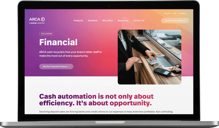


From product awareness to brand awareness.
ARCA was in need of a site update that honored the integrity of their well-established brand but that also created a refreshed, modern experience for their clients. At the time their current site was built ARCA’s technology had been relatively new, but since knowledge of their product was now more widespread, they needed to shift the focus of their site from product awareness to solidifying their brand presence and authority within the industry. Since their products are used very differently within different industries, they also wanted help figuring out how to create a website experience that spoke more directly and uniquely to each of their different client segments.
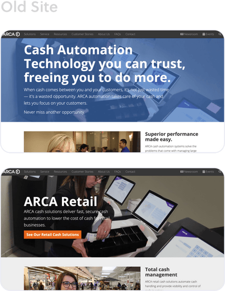
A bold new approach.
As we spent time learning about ARCA’s business and the things that set them apart, we began to design a new site that would help them tell the story of who their company really is. Changes to the structure of their site and navigation were made to help users navigate to the information that was most helpful to them. In order to highlight their technological authority, we made use of the variety in their brand colors and presented them with a bold, adventurous gradient feature that helps to visually solidify their cutting-edge leadership. Partnering this with human-focused imagery and conversational content tells users of their long history of client partnership and collaboration.
A site that serves their clients as well as their business does.
ARCA’s web presence now aligns with the excellent service and expertise that they are already so well known for. Their new design displays their unique approach and helps to solidify their presence as a leading brand in their industry.
Refreshed Branding
Having been in business for so long, ARCA came to us with an established set of brand guidelines but were open to seeing how we could creatively reshape it to form something renewed and refreshed. By pulling in the essential elements of their visual style but using them in new ways, we were able to update their image without losing the essence of the brand that was already so well-built.
Expanded Resources
True to their nature of excellent customer service, ARCA wanted their site to be full of helpful resources for their clients. We built out an extensive resource library organized by videos, articles, white papers, and informational industry topics, as well as creating custom related content links on singular content pages to aid users in exploring information most helpful to them.
An Easier Backend Experience
ARCA was having a difficult time being able to navigate and make necessary edits on the backend of their old site. One of our focuses in building out their new site was to create an easier experience for them to be empowered to make simple edits on their own.
