With 2022 almost upon us, it’s time to start looking ahead to upcoming web design trends! 2022 feels like a fresh start, so it’s the perfect time to refresh your most-used web fonts and explore new options.
If I’ve learned anything in my career as a web designer thus far, it’s that font choice matters. Selecting the perfect font for a web project is often the key thing that will either make or break a design. Fonts hold a lot of power to communicate – they have the amazing ability to reveal a brand’s voice, build personality, ensure readability, and subliminally tell the user if the brand is trustworthy and reliable. Use the wrong one, and your brand identity could fall apart; use the right one and your customers will come away with a better understanding of who you are.
But, with so many font options available and more being added daily, it can be difficult and overwhelming to try and dig through them all to find the perfect one – hours of designers’ time have been spent searching and scrolling through pages of typefaces. While it’s exciting to discover new ones, sometimes the time spent detracts from quality design hours.
Luckily for you, I’ve taken my hours of research and have compiled a list of the best web fonts of 2022! As an added bonus, all these fonts are either completely free or are included for use in your Adobe subscription, so you don’t need to break the bank to have that perfect font.
Sans Serif
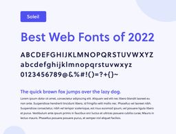
Soleil
Soleil was on my “Best Web Fonts” list last year and continues to remain a favorite as we head into 2022. A modern take on a geometric typeface, its simplicity and clear letterforms lend it well to both headings and body text. Want a sneak peek into what it looks like on a live site? Look no further – you’re reading it! We love Soleil so much that we’ve used it as the body font on our own site.
Designed by Wolfgang Homola. Published by TypeTogether.
Find Soleil on Adobe Fonts at the link below:
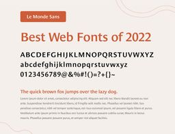
Le Monde Sans
Le Monde Sans was originally designed for the French newspaper La Monde and is a humanist typeface, meaning that it has roots in calligraphy and emulates the warmth and connection of an actual human hand. Its style makes it appear almost like a serif font, adding a certain classiness to it, but the lack of actual serifs and low contrast makes it highly legible, especially on digital screens.
Designed by Jean François Porchez. Published by Typofonderie.
Find Le Me Monde Sans on Adobe Fonts at the link below:
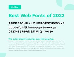
Chillax
Chillax is a geometric sans typeface, inspired by 1920s modernism and Bauhaus style. It was designed mainly for display applications and headlines rather than smaller body text, allowing for its unique letterforms and lively personality.
Designed by Manushi Parikh. Published by Indian Type Foundry.
Find Chillax on Fontshare at the link below:
Add a valid URL to the block settings to get started.
Laca
Though technically classified as a sans serif typeface, one might not be incorrect to label it a semi-sans. Its energetic and quirky style were inspired by retro Portuguese soap packaging, making it perfect for a brand looking to bring personality and warmth to their site. In fact, we love Laca so much here at Double Up Digital that we used it on our own website – check out our headings to see it in action!
Designed by Joana Correia. Published by Nova Type Foundry.
Find Laca on Adobe Fonts at the link below:
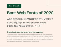
Roc Grotesk
Roc Grotesk is a sans serif grotesque font that was inspired by 19th century American wood types. Like many grotesque fonts, its style is less “polished” and more “quirky,” giving it a lot of character and charm. While it’s less suited to smaller paragraph text, Roc Grotesk shines in display settings.
Designed by Nikola Kostić and Zoran Kostić. Published by Kostic Type Foundry.
Find Roc Grotesk on Adobe Fonts at the link below:
Filson Pro
Filson Pro is a geometric sans serif typeface with a twist. Its geometric shapes make it highly visible and versatile for viewing, while its distinctive details, such as the curved tail on some of the letters, add a surprising and playful elegance to the typeface.
Designed by Olivier Gourvat. Published by Mostardesign.
Find Filson Pro on Adobe Fonts at the link below:
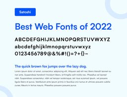
Satoshi
Satoshi is a modernist sans serif typeface, combining the typical grotesque style with geometrically-designed characters. Satoshi is great if you’re looking for a modern font that’s straightforward and beautifully clean without being boring. Because of its geometric leanings, it’s highly legible even at tiny sizes.
Designed by Deni Anggara. Published by Indian Type Foundry.
Find Satoshi on Fontshare at the link below:
Add a valid URL to the block settings to get started.
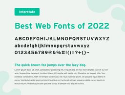
Interstate
Interstate is another typeface that was on my 2021 list, and with its classic style remains a top font for 2022. Designed in the 90s, it was inspired by the type on US highway signs in the 1900s and so gives a classic and familiar feeling. Because it was designed to be read from a distance while traveling via car, it is highly legible and easy to read, especially at larger sizes such as headings and display instances.
Designed by Tobias Frere-Jones. Published by Frere-Jones Type.
Find Interstate on Adobe Fonts at the link below:
Red Hat Display
Red Hat Display is another geometric sans typeface which was originally developed for the branding of Red Hat, an enterprise software company. With its circular structures and even lines, it has an open and uniform presence while still maintaining warmth. If you’re looking for even more legibility in body text, Red Hat also comes in a Text style.
Designed by Jeremy Mickel. Published by MCKL.
Find Red Hat Display and Text on Google Fonts at the links below:
Serif
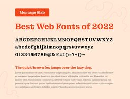
Montagu Slab
Montagu Slab is a slab serif display typeface, drawing inspiration from the classic fonts of the 19th century. Its sturdy characters and bold style make it a great choice for a brand that is looking to be distinct and creative. Because of its high contrast and funky details, its best used in display and heading instances.
Designed and published by Florian Karsten.
Find Montagu Slab on Google Fonts at the link below:
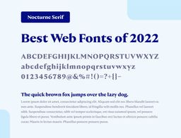
Nocturne Serif
Nocture Serif is another good choice if you’re looking for an engaging serif font. Originally inspired by stone tablet lettering in Warsaw architecture and World War II memorials, it has a very classic, sharp, & substantial presence.
Designed by Mateusz Machalski. Published by Capitalics.
Find Nocturne Serif on Adobe Fonts at the link below:
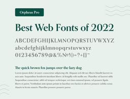
Orpheus Pro
Orpheus Pro is a serif font inspired by the designs of Walter Tiemann in the 1920s. Its inspiration is based in the combination of classic Roman fonts with Art Deco styling, giving it a beautiful mixture of tradition and ornateness. Reminiscent of calligraphy, its flowing nature makes it an excellent choice for a brand looking to portray class and warmth.
Designed by Kevin King and Patrick Griffin. Published by Canada Type.
Find Orpheus Pro on Adobe Fonts at the link below:
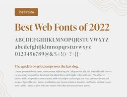
Ivy Presto
Ivy Presto is an Old Style display typeface based off of the work of Hendrik van den Keere in the 16th century, revived with the intention of making it cleaner and crisper for the modern world. With its very high contrast, it lends itself best in display usages, and adds a graceful sophistication to designs.
Designed by Jan Maack. Published by Ivy Foundry.
Find IvyPresto on Adobe Fonts at the link below:

